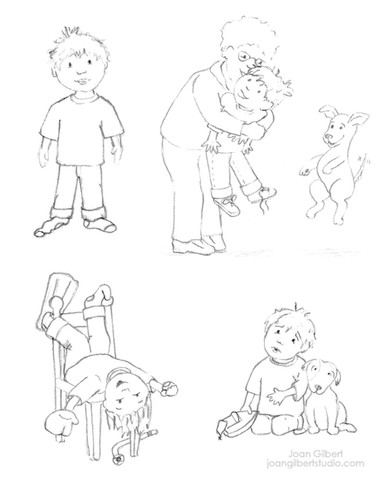
top of page

Going to Meet Dad


I had the privilege to illustrate the children's book, Going to Meet Dad, with author Kathleen Heinz.


What will it be like to meet my dad? four-year-old Sammy wonders, after growing up with no father. He experiences lots of feelings as he thinks about seeing his dad for the first time. He’s curious. He’s excited. He’s worried about what this man might think of him. Does he even want to go meet this stranger? While he’s deciding, Sammy discovers a surprising strength he knows he can count on, no matter what.


Below are seven of the fourteen double-page spreads without text. In this book, there are two levels of illustrations. When Sammy is in the present, the backgrounds are sparse and adults are minimally represented. When Sammy is thinking back to memories, or imagining the future, the illustrations are more detailed and take place within blue bubbles.


The book is due to be released in June. Keep scrolling to see the process.


The Process


Character design

After reading the manuscript and getting direction from the author, my first step was to develop the look of the main characters. I presented these (below, left) to Kathleen and we decided to make Sammy a little older (below, right) which involved increasing the body size in relation to the head, mostly through elongating the arms and legs.


Storyboard

The pacing of the book is often left to the illustrator/designer, but in this case Kathleen is a designer herself and came in with a solid vision. Developing the illustrations to execute this vision still allowed me a lot of freedom. After submitting the storyboard for approval, there were a few tweaks, including subbing in up-side-down Sammy in a chair (presented in the initial sketches) as a stronger opening illustration.


Refining the rough storyboard sketches

Taking one illustration at a time, I needed to tighten up the rough sketches to use them for the final illustrations. This is the step that took me the longest—making sure the boy and his dog looked consistent from page to page and creating realism for the backgrounds. Each final sketch was sent to Kathleen for approval.


Ready to Ink

I don't always use a strong black outline for my illustrations, but in developing a style for this book, this is what we came up with and I think it works well. Laying the final sketches on a light table, I used a brush and waterproof black india ink to "trace" each one onto nice watercolor paper.


Painting!

I was so excited to finally start painting, and in many ways, this was the quickest step. Blue bubbles were painted separately and combined with the illustrations in Photoshop. This gave me more flexibility as I fit multiple illustrations together on one spread.


Final Approval

For the final OK I added the text to each spread so we could see the layout as a whole. A few of the illustrations had minor changes or adjustments, but due to an oversight on my part, this spread needed a change to one of the dog breeds. Instead of repainting the whole illustration, I repainted the dog and used Photoshop to drop it in. You may also notice a change to the brown dog's face.


Final illustrations, without text, were sent to the book designer who deals with type and other details for printing. I'm very excited to see the final product!


2 comentarios


Way to go, Joan! Wonderful work.

Me gusta

Joan - this is incredible! You are the most talented person I know. This book is going to be a huge success. I love everything about it! Lots of love, Kelly Murray

Me gusta
bottom of page